Final Portfolio
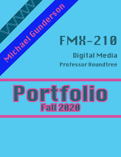
This is my final portfolio of all of the art that I have made in this class. I chose the colors blue and pink to be the theme of this portfolio because they are some of my favorite colors and I liked the ways that they contrasted with each other. For my table of contents, I decided to add little logos in front of every assignment title, these logos represent the program used to create the project. For the about me section, I added two pictures of me and wrote a basic description of myself and my experience in digital media. After the about me, I used a two page spread for my canvas image. I did the same thing for my calligram. One of my favorite parts about my portfolio is the way that I incorporated the program logo in the two page spread design for the first two pages within each program unit. For my autoscopy, I decided to mirror the pages, with one having the title and actual autoscopy image, and the other one has the text and my inspirational images. I end with "...


Nice job with your masking. For the most part everything is pretty clean. There are a couple places where the mask in one part of your image bleeds into the background or another part. For the monochromatic and square images, you could use another color to add to your face as well. Right now your face becomes the focus of the image since it's black and white. Nice work!
ReplyDeleteThis is very appealing to the eye. You did a great job with your masking.You chose some great color schemes. They are all appealing and you make it work perfectly. You have a great balance throughout all of these images. My favorite has to be the monochromatic or the square. They both have a great variation and contrast. Great work
ReplyDelete