Final Portfolio
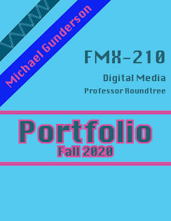
This is my final portfolio of all of the art that I have made in this class. I chose the colors blue and pink to be the theme of this portfolio because they are some of my favorite colors and I liked the ways that they contrasted with each other. For my table of contents, I decided to add little logos in front of every assignment title, these logos represent the program used to create the project. For the about me section, I added two pictures of me and wrote a basic description of myself and my experience in digital media. After the about me, I used a two page spread for my canvas image. I did the same thing for my calligram. One of my favorite parts about my portfolio is the way that I incorporated the program logo in the two page spread design for the first two pages within each program unit. For my autoscopy, I decided to mirror the pages, with one having the title and actual autoscopy image, and the other one has the text and my inspirational images. I end with "...


I love how the final product turned out - the photo you edited into the movie scene was nicely adjusted in terms of color/hue and placement! I think the shirt and sunglasses were also a nice touch so that you fit-in to the scene better.
ReplyDeleteI think this was a very successful image! I love how you matched the clothes of the people from the original movie, it definitely helps sell your image. You also matched the lighting really well!
ReplyDeleteI think this came out great. The lighting matches very well and it could not have been easy due to the warmer hues in the original photo. The way you did your hair also helps sell the image because it looks pushed back and in the wind like the original photo.
ReplyDelete